Sion Lloyd
We all know that different visual presentations of data can change how much we can take away from it, and might even alter our response to it. This is true whether we are talking about infographics – which make difficult concepts easier to understand – or the various dashboards and graphs that we are presented with by our monitoring tools.
I was reminded of this recently when turing, the tool we use to monitor our DNS traffic, showed an odd signal in the number of AAAA requests and also, perhaps unsurprisingly, in the IPv6 traffic we were seeing. Here is a small section from our dashboard showing the two plots which caught my eye:
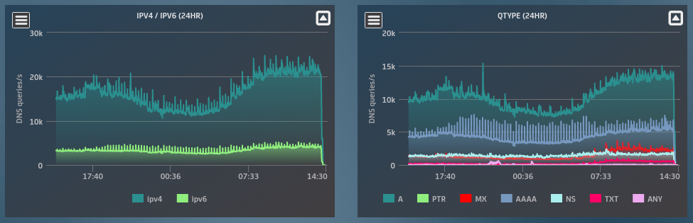
The blue line on the right hand graph (AAAA requests), and to a lesser extent the green line on the left hand graph, show a rise in their variation. This may be noise, although it looks periodic so might also be an interesting signal.
In order to look more closely, we can set some filters: AAAA requests over IPv6. In doing this we get the following graph:
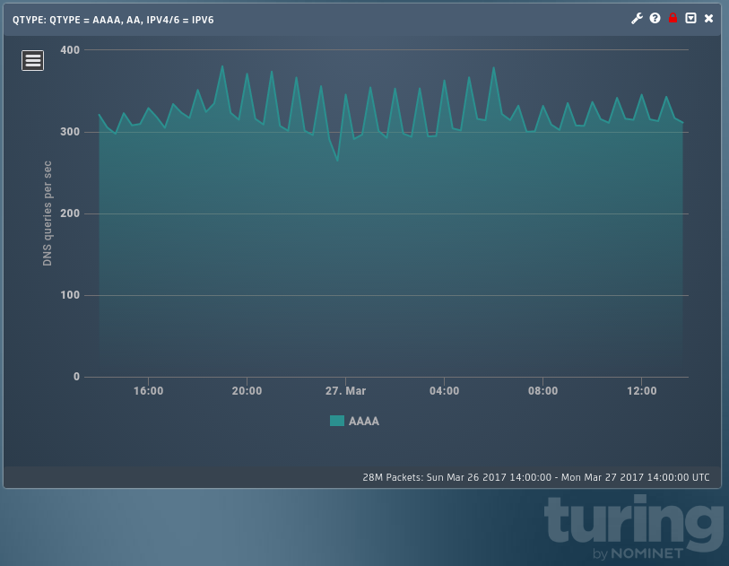
Where has our signal gone? I can see some periodicity but not like we saw before. Perhaps I got the filters wrong? No. By default we try to get 60 points on a graph, so we bin the data differently depending on the length of the time period being displayed. In this case we have 24 hours on show, so the default resolution is 20 minutes. This results in events being averaged out and a loss of information on the finer structure.
The dashboard graphs have a bin size of one minute so switching the graph to that resolution should get us back to the view that interested us in the first place. We now get the following:
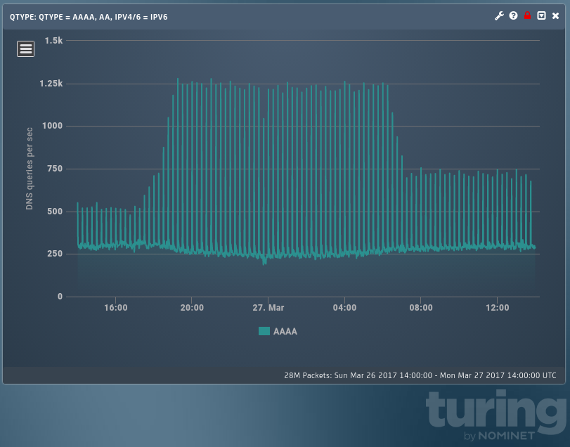
Note that the underlying data here is identical, but we can now see the periodic signal again. We can also see clearly that its magnitude increases for some time and then drops down but remains higher than the early signal.
Note that we can go too far with this approach and drop the bin size so low that the noise drowns out the signal. This is a well-known problem, and finding the balance between smoothing out noise and over-smoothing features is not always easy. It is also a decision that needs to be taken when doing machine learning on data. Too much smoothing and you see very little, missing a lot of interesting events; too little and you quickly become swamped by false positives.
We have a behaviour which, provided we look at the correct scale, is quite clear, but can other ways of plotting this data shed any more light on it? Another view we have takes us away from a traditional timeseries plot and moves to a “time vs time” plot. This can make periodic signals easier to understand, and using this we get:
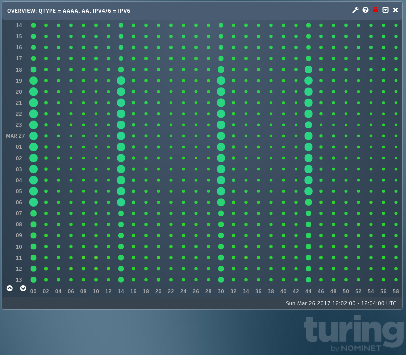
Here we are using the one-day overview to plot the same 24 hour period with the same filters set. Each dot represents two minutes’ worth of traffic; the size of the dot being proportional to the volume of traffic. Each row is one hour and contains 30 dots.
Now we can clearly see that not only is the signal periodic, it is tied to the top of the hour and every 15 minutes. What we can’t so easily see is the profile of the envelope – this was much clearer in the timeseries plot. Signals with differing periodicities can be highlighted by varying the timescale of the x-axis.
I am not, in this article at least, going to attempt to explain the source of this signal. The point is that in order to get as much information out of your data as you can, you need to be prepared to look at it in different ways and at different scales.